Tuesday, 29 March 2016
Final Major Project: The Human Body
My final project is the last assignment combining all of the specialist skills which I have learnt and developed over the past 2 years. This being our last assignment we have to propose our own idea in a lot of depth having a certain pathway whether that is photography, painting, sculpture etc. Towards the end of this project we will have to make our last final outcome which will be exhibited in the End of Year show during the week commencing the 6th June 2016.
After much deliberation I have chosen my theme which is based on The Human body and specifically how the body moves by researching into the bones and muscles by doing some studies using a range of different medias/materials. As well as this I will research into to artists who incorporate the body using Pinterest and resources.
Artist Presentation
Danny Quirk: The exhibition in ‘The Requited’ at The Northampton Center For The Arts overall was made to be viewed as one large piece or experience. Like a progressive album, each piece leads into the one following it as if were a journey. " I wanted to name it ‘(Un)Requited’, but, new year, figured I'd go with a happier approach. It starts dark, but eventually gets happy in the end."- Danny Quirk http://www.dazeddigital.com/artsandculture/article/12461/1/danny-quirk-anatomical-self-dissections
Like Quirk I could create a journey throughout the human body maybe create 4 pieces and show different bodies filled in with bones/muscles/organ and see how its all made up to create our body and show how it works. Another way of showing the body is maybe how a segment ages whether that's externally or internally eg effects of smoking etc.
Thursday, 10 March 2016
Artist Inspiration: Journeys
Andy Warhol
I would say that I was most inspired by Andy Warhol considering he has done both printing methods (blotted line and screen printing). So I think it'll be nice to combine to the two.
I liked how he varied the lines in his blotted line changing the thickness etc to create different textures. This is what I have tried through out my experimentations and developments by using my own photos.
I was very much inspired by his screen prints also because I like how clean every edge is so I'll try to do this in my outcome contracting with the messy blotted line however I will explore messier edges and perhaps enhance them to link with the main piece in the middle.
Ian Murphy
I personally love Murphy's work due to the amount of texture created by a fine liner using mark making such as cross hatch, pointillism and lots more.
Throughout my development I linked blotted line with this kind of mark making by adding more texture and depth to the piece. If some stencils of the logo go a bit rough round the edges I could just enhance them by going over with fine liner adding more texture like Murphy.
Saturday, 21 November 2015
Link to another Art and Design Blog
http://drawingsandnotes.blogspot.co.uk/
Here's a link to another art and design blog which explores and presents different pieces of art which includes the information of the artist who created and the date it was made. This blog shows a diverse range of work from drawing to textiles. Which can inspire anyone to do their own work along the lines of a specific artist.
Few examples:


Exquisite Corpse Inspirations
Throughout this topic I have been inspired by five artists with completely different styles and different media which I wanted to incorporate in to my final outcome somehow.
The main artists that I have been inspired by are Peony Yip and Charlotte Caron who are both contemporary artists.
The main artists that I have been inspired by are Peony Yip and Charlotte Caron who are both contemporary artists.
Charlotte Caron
Caron is a multi disciplinary artist combining photography and painting. She paint animals onto her own photos linking the animal with either their personality or looks. 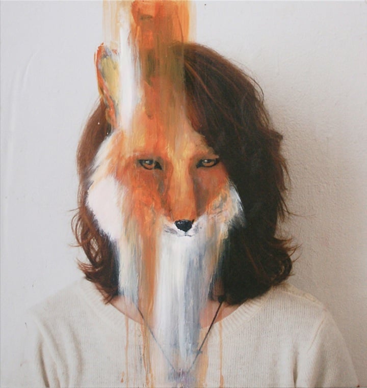

Peony Yip
Yip is a contemporary artist who is fairly new. She has been developing her style until she feel its good enough to be in certain exhibitions. her work is mainly illustration which consists of drawings with another drawing overlaying (red pen) which would be an animal linking to the angle/position of the person.
I was inspired by her portraits of bugs because they were very weird and odd which links with this project very well. As these bugs were coming out of all kinds of places such as the mouth and eyes etc. Again these portraits were done by pencils and colour pencils ( to create contrast).

Monday, 1 June 2015
Logo Process

On the trafficking part I still used the pen tool but while I was doing it I used fill so it would automatically turn black when I have done it.
Graphic Image Editing process

Here is my graphic image. The first step of making my graphic image was to use the blemish tool to remove any kind of imperfections. Making the skin look smoother,

To make my image more emotional for the public I decided to make it black and white. Adjustments> Black and white

As I have changed the image to black and white I need to exaggerate the dark areas. This was done by decreasing the red tones a lot. Exaggerating the under eye area making it look like she has had no sleep.

Here is my final graphic image. Personally I really like how it turned out. I feel like it would create a reaction from the public. Showing that Human trafficking is still happening especially where you live but you don't necessarily suggest people are getting taken.
Lighting:To take these photos I needed some specialist equipment
.White Background
.x3 soft boxes
-one near the white background to make it high key f16.2
- another one mid chest height f8.4
-finally one at head height f8.0
.DSLR D3000
.1/60
.f/9
.100 ISO
Subscribe to:
Posts (Atom)