Through out this process it has come to this. Choosing which poster portrays Human Trafficking the most and which one create a reaction.
1: Statistic Poster
I wanted to see what my poster would have looked with some text on it. From doing research I have seen many statistics however only one really stood out to me the most which clearly links with my graphic image and that is "80% of the victims are women". Obviously that is a high statistic which will get jaw dropping reactions.
Just like Amnesty international I felt like I needed to emphasise a word I think Women should be in red. Making a huge statement saying the majority of victims are women.
Looking at this potential poster I feel like the poster is too crowded especially on the left side because of the text and logo being there. As well as this there is a slogan on the bottom right. I think the image speaks for itself.
2: Not for Sale : white
To show I have explored colour I wanted to make the writing on the tape stand out more. So I decided to make it white. To do this I used the pen tool however I didn't want it all neat and precise so I used the blemish control brush to make it a bit more sketchy. Although the whole image itself doesn't work for me because the writing to so white there is too much contrast as it appears quite harsh.
3:Stop Human Trafficking
For this poster I kind of went really basic on this one because I feel like the image speaks for itself. Especially with the not for sale sign. Although its basic it clearly shows I was inspired by Amnesty international and Federica Erra due to the style (exaggerating areas etc). The logo is on the top right along with the slogan.
In all poster developments it clearly shows I kept to the same colour scheme black, white and red. Just like Amnesty International. There is little red in the poster yet shows the importance of the words to the issue/theme. Personally I feel like the third poster is the best one due to little text and simple layout. It wont be too complicated. The majority of the public will be able to understand it.
Sunday, 31 May 2015
Tuesday, 26 May 2015
Logo Timeline
WWF Logo Transformation
Here is the logo transformation starting from 1961 to 2000. As you can tell it has changed a lot due to the technology we now have.
1961
Compared to the other logos you can tell that this one was drawn because it looks sketchier and less precise. As well this the logo is quite small and it doesn't stand out as much as much as the others. Logos have to be simple so viewers can understand. You can clearly tell its a panda how I think the panda could have been drawn out simpler. As each part is drawn individually also it isn't as simple as the others because there is some kind of shading in their. To make it simpler they could have used a block colour.
1961
From the first logo you can clearly tell the difference. The whole logo has been simplified. There is no shading in it so its just a block colour which I think relates back to the panda clearer. The image itself looks neater and it looks more professional. The logo itself has been enlarged which I think looks better. However not all lines are smooth. The obviously wanted the rough lines to present the fur of the panda.
1978
There is a clear change between the previous logos. The lines have been done neater. there are no rough sketchy lines which I think it makes the logo looks simpler. The stance of the panda has changed it look broader. The space in between the legs have increased. The ears have decreased in size.
1986
The duration of this ;logo process clearly shows the development in technology especially in this logo made in 1986. A vast amount of thing have changed to make this logo. There are less lines especially the outlines have been taken out because the panda matches the background anyway.
The facial features have changed. Not only is there an image they have clearly decided to add text to represent the company making it memorable for the viewers. They are a lot bigger and more defined making it look more like a panda. The whole logo itself looks simpler, bigger and better.
2000
Not much has changed from the last logo in 1986 apart from enlarging the logo and changing the type face making it bigger and bolder. The font has transformed from being a serif to an san serif.
Shell's Logo Transformation

1900
From the first logo you cant really tell what it only until you look at it closely. I'm not too sure why they chose this kind of shell. As you can tell it is a black and white logo which doesn't look eye catching at all making it not memorable to the viewers.
1904
From the first logo you can tell it has improved do to the actual image looking like a shell. However for a logo to be successful it has to be simple. It has some specific shading within the image making it more complicated. As well as this I don't think the black box is needed.
Shell's Logo Transformation
1900
From the first logo you cant really tell what it only until you look at it closely. I'm not too sure why they chose this kind of shell. As you can tell it is a black and white logo which doesn't look eye catching at all making it not memorable to the viewers.
1904
From the first logo you can tell it has improved do to the actual image looking like a shell. However for a logo to be successful it has to be simple. It has some specific shading within the image making it more complicated. As well as this I don't think the black box is needed.
1909- 1930
Form looking at these logos you can tell that the black background has been taken away and the shading is minimal. Making the logo look a lot simpler but it still needs colour to make it stand out a bit more.
1948-1955
Colour has been explored clearly showing a colour palette which is red and yellow making it more interesting and memorable if they keep the same colour palette throughout. Not only was the colour explored but there is text. Although it has changed between these two. Where the text was white I feel like there was too much going on with the red and yellow. So then they changed it to red which fits the colour scheme better in my opinion. The shell itself is a lot more simple because there is minimal detail/shading.
1961
The only thing that has changed in this logo is that it has a background. I'm not to sure if I like it. I feel like the log blends into the background making it less eye catching.
1971-1995
Between these two the colour scheme has changed but then changed back. Looks like they changed the position of the text making it under the logo. As well as this it looks like they got rid of the background but wanted to change the thickness of the lines by making them stand out more.
1999
Here is the final logo showing they have removed the text due to the logo itself being self explanatory. The duration of making this logo has made it simpler due to the development of technology.
Apple's Logo Transformation
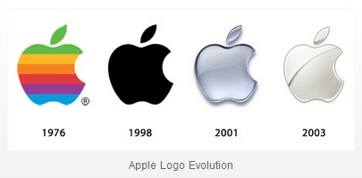
1976
The logo itself looks very simpler how it looks too busy. Its quite eye catching. Too many colour personally.
1998
Probably the simplest one out of the lot due it looking like a silhouette. It's just plain black. People could say it's boring and no one would remember it.
2001
Explored colour throughout the process. This logo has shading in it making it look 3d unlike the logo in 1998. It looks smart as well as this I feel like the logo itself is very versatile.
2003
The final logo showing development in the shading department and the lighting. It isn't as dark as the other logos because they have a solid line between the background whereas some areas of this logo blends in the background.
Friday, 15 May 2015
Timeline of Posters
1880's:

Poster Designed by: Currier & Ives
Date: 1880
Used to: Present the voters the participants in the United States Election.
Lack of colour due to the cost of printing especially because this would have been printed several times across USA. (Mass Production)
1890's:

Artist: Unknown
Company: Coca-Cola
Purpose: To present the product as a medicinal drink helping with head aches and physical exhaustion.
Light colours used to attract the customers. Although they aren't the most eye-catching colours because they aren't crazy bright. This might be due to the amount of money to produce this poster several time. As Coca Cola was and still is a popular brand.
1900's:

Artist: Toulouse Lautrec
Title:Art Nouveau Poster
Date: 1990
Minimal colour. Majority of it is either brown or black. Again very expensive to print colour out.
1910's:

Company: Cadbury's
Date: 1910
A lot more colour especially vibrant ones. Seems more complicate than previous posters
Artist: Unknown
Used to present the public that children love chocolate. Like they get excited over it.
1920's:

Artist: Dominion Mark
Company: greengrocers
Date: 1920
Used to show that healthy food is good for you " the fruits of perfect health"
1930's:

Date: 1930
Occasion: World Cup
Artist: csfotobiz ???
Used to present the World Cup as it was important for millions of people and still is.
1940's:

Date: 1940
Artist: Unknown
War
Used to persuade people to volunteer to work in the army to win the war " Volunteer for Victory"
"YOUR" very direct
1950's:

Date: 1950
Artist: Waldemar
Title: Sunset Boulevard
1960's:

Film Poster
Date: 1960
Artist: Unknown
Used to promote a movie staring a load of actors and actresses
1970's:

Date: 1970
Artist: Tad Hunter & San Andreas
Purpose: To show fans when the dates they are playing
1980's:

Artist: Unknown
Date: 1980
Purpose: To promote a film
1990's:
Date: 1990
Artist: Unknown
Purpose: to promote the film
2000:

Date: 2000
Artist: Unknown
Purpose to promote a movie
Poster Designed by: Currier & Ives
Date: 1880
Used to: Present the voters the participants in the United States Election.
Lack of colour due to the cost of printing especially because this would have been printed several times across USA. (Mass Production)
1890's:
Artist: Unknown
Company: Coca-Cola
Purpose: To present the product as a medicinal drink helping with head aches and physical exhaustion.
Light colours used to attract the customers. Although they aren't the most eye-catching colours because they aren't crazy bright. This might be due to the amount of money to produce this poster several time. As Coca Cola was and still is a popular brand.
1900's:
Artist: Toulouse Lautrec
Title:Art Nouveau Poster
Date: 1990
Minimal colour. Majority of it is either brown or black. Again very expensive to print colour out.
1910's:
Company: Cadbury's
Date: 1910
A lot more colour especially vibrant ones. Seems more complicate than previous posters
Artist: Unknown
Used to present the public that children love chocolate. Like they get excited over it.
1920's:
Artist: Dominion Mark
Company: greengrocers
Date: 1920
Used to show that healthy food is good for you " the fruits of perfect health"
1930's:
Date: 1930
Occasion: World Cup
Artist: csfotobiz ???
Used to present the World Cup as it was important for millions of people and still is.
1940's:
Date: 1940
Artist: Unknown
War
Used to persuade people to volunteer to work in the army to win the war " Volunteer for Victory"
"YOUR" very direct
1950's:
Date: 1950
Artist: Waldemar
Title: Sunset Boulevard
1960's:
Film Poster
Date: 1960
Artist: Unknown
Used to promote a movie staring a load of actors and actresses
1970's:
Date: 1970
Artist: Tad Hunter & San Andreas
Purpose: To show fans when the dates they are playing
1980's:
Artist: Unknown
Date: 1980
Purpose: To promote a film
1990's:
Date: 1990
Artist: Unknown
Purpose: to promote the film
2000:
Date: 2000
Artist: Unknown
Purpose to promote a movie
Sunday, 10 May 2015
Presentation
There are a few ways you can present a final outcome in exhibitions. The most common way to present a piece of artwork is up in a wall so observers can see every detail within the portrait etc.
Other ways to present artwork is in a glass box, on the floor, framed, and up onto the wall. Some of these ways will not work with my proposed outcome. For example the glass box wouldn't work because my final outcome won't fit in just a box. However if it was put in a wall with a box surrounding the artwork then that would work. Especially with the health and safety within the exhibition, however having a glass box surrounding the piece of work may lose the texture in the proposed outcome. Which is the main focus of the final piece. 
The work wouldn't be able to be put in te floor because of it would be a hazard to people in the exhibition as well as this you would t be able to clearly see the whole outcome because no one is tall enough to see the whole thing. Due to the proposed outcome to be very large. 
There is one way I could present my final proposed outcome. Which is it being mounted on a thick bit of wood so everything is supported . Then putting it high up on a wall so it is out of everyone's way dso it wouldn't be much of a hazard.
Tuesday, 5 May 2015
Grids
Grid System:
Probably the most organised system which is quite system. I think this is commonly used in newspapers. Where headlines and sub headings are separated from the majority of text. Each column starts in the same place just after a small gap. Here is an example of a grid system being used in a poster. The text is clearly in section/columns.

Transitional System: This system can be seen as messy as the majority of text is overlapped. So not everyone can get all of the information about an event for example because its so busy. As well as this the lines of text are very close together which again makes it harder to read. David Carson is well known for using this system in his posters.

Radial System
Radial system starts from a specific point then going outwards like a diagonal line. So you would end up with some kind of circle for example. Lines of text going out to perhaps lead your eyes to something else like an image or statistic. Commonly used around a shape.
 Modular system
Like the grid system this is quite organised because words have to be within a shape. Whether it its rotated enlarged etc.
Axial System
This is used so text can start off in an angle. Any angle If you start with a slanted line you can start text wherever on that line.


Probably the most organised system which is quite system. I think this is commonly used in newspapers. Where headlines and sub headings are separated from the majority of text. Each column starts in the same place just after a small gap. Here is an example of a grid system being used in a poster. The text is clearly in section/columns.

Transitional System: This system can be seen as messy as the majority of text is overlapped. So not everyone can get all of the information about an event for example because its so busy. As well as this the lines of text are very close together which again makes it harder to read. David Carson is well known for using this system in his posters.
Radial System
Radial system starts from a specific point then going outwards like a diagonal line. So you would end up with some kind of circle for example. Lines of text going out to perhaps lead your eyes to something else like an image or statistic. Commonly used around a shape.
Like the grid system this is quite organised because words have to be within a shape. Whether it its rotated enlarged etc.
Axial System
This is used so text can start off in an angle. Any angle If you start with a slanted line you can start text wherever on that line.
Bilateral system
Again this is an organised system however the text can start anywhere however you have to stick tot he same column going to the next line repeatly.
Subscribe to:
Posts (Atom)