WWF Logo Transformation
Here is the logo transformation starting from 1961 to 2000. As you can tell it has changed a lot due to the technology we now have.
1961
Compared to the other logos you can tell that this one was drawn because it looks sketchier and less precise. As well this the logo is quite small and it doesn't stand out as much as much as the others. Logos have to be simple so viewers can understand. You can clearly tell its a panda how I think the panda could have been drawn out simpler. As each part is drawn individually also it isn't as simple as the others because there is some kind of shading in their. To make it simpler they could have used a block colour.
1961
From the first logo you can clearly tell the difference. The whole logo has been simplified. There is no shading in it so its just a block colour which I think relates back to the panda clearer. The image itself looks neater and it looks more professional. The logo itself has been enlarged which I think looks better. However not all lines are smooth. The obviously wanted the rough lines to present the fur of the panda.
1978
There is a clear change between the previous logos. The lines have been done neater. there are no rough sketchy lines which I think it makes the logo looks simpler. The stance of the panda has changed it look broader. The space in between the legs have increased. The ears have decreased in size.
1986
The duration of this ;logo process clearly shows the development in technology especially in this logo made in 1986. A vast amount of thing have changed to make this logo. There are less lines especially the outlines have been taken out because the panda matches the background anyway.
The facial features have changed. Not only is there an image they have clearly decided to add text to represent the company making it memorable for the viewers. They are a lot bigger and more defined making it look more like a panda. The whole logo itself looks simpler, bigger and better.
2000
Not much has changed from the last logo in 1986 apart from enlarging the logo and changing the type face making it bigger and bolder. The font has transformed from being a serif to an san serif.
Shell's Logo Transformation

1900
From the first logo you cant really tell what it only until you look at it closely. I'm not too sure why they chose this kind of shell. As you can tell it is a black and white logo which doesn't look eye catching at all making it not memorable to the viewers.
1904
From the first logo you can tell it has improved do to the actual image looking like a shell. However for a logo to be successful it has to be simple. It has some specific shading within the image making it more complicated. As well as this I don't think the black box is needed.
Shell's Logo Transformation
1900
From the first logo you cant really tell what it only until you look at it closely. I'm not too sure why they chose this kind of shell. As you can tell it is a black and white logo which doesn't look eye catching at all making it not memorable to the viewers.
1904
From the first logo you can tell it has improved do to the actual image looking like a shell. However for a logo to be successful it has to be simple. It has some specific shading within the image making it more complicated. As well as this I don't think the black box is needed.
1909- 1930
Form looking at these logos you can tell that the black background has been taken away and the shading is minimal. Making the logo look a lot simpler but it still needs colour to make it stand out a bit more.
1948-1955
Colour has been explored clearly showing a colour palette which is red and yellow making it more interesting and memorable if they keep the same colour palette throughout. Not only was the colour explored but there is text. Although it has changed between these two. Where the text was white I feel like there was too much going on with the red and yellow. So then they changed it to red which fits the colour scheme better in my opinion. The shell itself is a lot more simple because there is minimal detail/shading.
1961
The only thing that has changed in this logo is that it has a background. I'm not to sure if I like it. I feel like the log blends into the background making it less eye catching.
1971-1995
Between these two the colour scheme has changed but then changed back. Looks like they changed the position of the text making it under the logo. As well as this it looks like they got rid of the background but wanted to change the thickness of the lines by making them stand out more.
1999
Here is the final logo showing they have removed the text due to the logo itself being self explanatory. The duration of making this logo has made it simpler due to the development of technology.
Apple's Logo Transformation
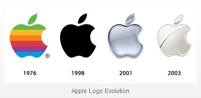
1976
The logo itself looks very simpler how it looks too busy. Its quite eye catching. Too many colour personally.
1998
Probably the simplest one out of the lot due it looking like a silhouette. It's just plain black. People could say it's boring and no one would remember it.
2001
Explored colour throughout the process. This logo has shading in it making it look 3d unlike the logo in 1998. It looks smart as well as this I feel like the logo itself is very versatile.
2003
The final logo showing development in the shading department and the lighting. It isn't as dark as the other logos because they have a solid line between the background whereas some areas of this logo blends in the background.
No comments:
Post a Comment